Misinformation Visualization: Why You Shouldn't Believe Everything You See

Don’t believe everything you see — it’s one of those age-old bits of wisdom that can serve us well in many areas of life, including the visualization of your business mapping data. Data visualization can be an invaluable analytical and strategic planning tool for just about any organization. But, as with any tool, it is vital to use data visualization in an appropriate manner.
In this post, we will take a close look at the various ways that data visualization could be misleading, misinforming or even deceiving. We will also provide tips on how you can avoid the pitfalls that so often lead to misinformation when interpreting business data.
What Is Data Visualization?
Data visualization generally refers to any activity designed to help individuals gain a better understanding of the significance of specific data by placing it in a visual context. Another way to look at it is that data visualization provides a means of bringing dry, one-dimensional pieces of information to life. Mapping is one of the most common — and effective — data visualization tools for business owners and managers, as it allows them to obtain a fresh, clear perspective that is likely to elude them when viewing rows and columns of data on a spreadsheet printout or computer screen.
Who Uses Data Visualization?
Organizations in a wide range of industries use data visualization as a regular component of their strategic planning activities. There are many industries that derive huge benefits from the vast array of business mapping software features available such as performing comprehensive market analyses for multiple locations, designing profitable, cost-effective sales territories, route optimization and creating powerful reports and presentations, all through the use of maps. These map enabled industries include retail, banking and finance, insurance, healthcare and consumer goods manufacturing — to name a few.
Why Is Data Visualization Important?
Data visualization is an invaluable resource for analyzing your current customers, prospects and competitors. Used effectively, it will help you maximize your sales opportunities and identify potential areas of vulnerability. How can you use data visualization to improve organizational performance? Here is a brief summary of the many benefits derived when visualizing your data with business maps:
- Identify marketing and sales patterns in your coverage areas.
- Spot new customer purchasing trends as they emerge.
- Create a variety of analysis using your most relevant business data.
- More easily share data with colleagues through shared web maps.
- Identify the location-based factors that influence the way your customers and prospects act.
- Gain a better understanding of where to locate/distribute your company’s products and services.
- More accurately predict and communicate sales volumes on a territory, local, state or national basis.

How to Create a Map for Data Visualization
Creating a map with the advanced visualization features you need to maximize the data visualization process is easy with the help of business mapping software. It’s a relatively simple five-step process:
- Develop an Excel spreadsheet that contains comprehensive address data for your customers, prospects and/or competitors.
- Add any additional relevant data that pertains to your impending business decisions.
- Import any custom symbols that relate to your specific business or industry so you can use your map to communicate more clearly with your particular audience.
- Define specific coverage areas such as sales territories and area of interest using zip codes, counties or Census tracts. Think through how your business is defined geographically.
- Review your data to assure accurate location information is applied.
Identifying Data Malpractice
There’s no doubt that data visualization has a powerful impact on the audience, whether it consists of a group of colleagues, customers or prospects. However, this can be somewhat of a double-edged sword. The same characteristics and benefits that make visualization such an effective tool can also lead to what is known as “data malpractice.” In other words, it is easy to be misleading with your data — in both intentional and unintentional ways. Thus, the distortion of data can have intended or unintended consequences for your audience and your organization.
The Three Basic Ways Data Visualization Can Be Misleading and Misinforming
By its very nature, data visualization is the embellishment of information. One could make a comparison between data visualization and advertising. The latter often entails the “enhancement” of the features and benefits of a product or service with the use of persuasive marketing tactics — think of a glossy magazine picture that makes a food product look irresistibly appetizing or a weight loss commercial that promises to make women look like swimsuit models if they follow a specific diet plan.
Data visualization that uses mapping as a vehicle for presenting data can have a similar effect. Mapping software gives the user the flexibility to “manipulate” the data to present information in the most favorable light. As we will see later, the method in which a graph, chart or map is created can have a major influence on the way an audience interprets the data — for better or for worse.

Misinformation with data visualization can occur in three ways:
- Transparent Misinformation: Inherent in virtually every data visualization process that involves mapping. For instance, everyone understands that a map symbol of a tree represents more than just tree – it actually indicates the presence of a wooded area or forest containing several trees or subset of data instead of just one specific data point. This feature is what enables mapping to provide the desired visual effect.
- White Lies: We make use of “little white lies” in many aspects of our daily life — we compliment someone on a new hairstyle or state that we loved a meal — even if we don’t always truly mean what we say. By the same token, data visualization enables us to “exaggerate” certain statistics or details to drive home a point. For example, we can round a figure up or down for the sake of clarity when displaying it on a map, even though it does not represent the exact value.
- Misrepresentations: Data visualization can also be used to misrepresent information for the purpose of conveying a bias, with the ultimate purpose of persuading the audience to subscribe to a certain point of view. This can be done on a subconscious level or with a true intent to deceive the audience. An example is the use of a bright red color to indicate that the sales of a product in a specific geographic region is “hot” during the previous quarter, even though they may actually be down over a longer period of time.
Examples of Ways Data Visualization Can Be Misleading
There is a wide range of data visualization techniques that can misinform and even mislead the audience. Examples include:
1. Creating Non-Zero Baselines
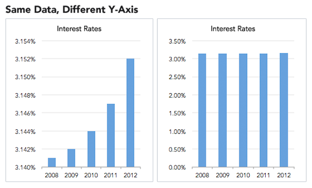
The typical line graph or bar chart consists of two lines that form a right angle and establish the data coordinate plane. The x-axis represents the horizontal line across the bottom, while the y-axis is the name for the vertical line that extends in an upward direction from the x-axis. One common “trick” is to create a y-axis on a bar chart that starts with a value that is something greater than zero. This has the effect of skewing the visual comparison in a way that improperly emphasizes the difference between the bars, which can lead to misinterpretation on the part of the viewer. This can be accomplished on a map too. For instance, in a demographic population map color coding only zip codes that have at least 500 people living there.

This is a classic example of how creating a non-zero baseline can alter one’s perception of the data. The bar graph on the left uses a y-axis starting point of 3.14 percent, making it appear that interest rates have soared over a four-year period. The graph on the right uses a starting point of zero for the y-axis, which paints a more accurate picture of how interest rates have actually remained relatively flat over time.
2. Misleading Colors
One of the more popular features of mapping software is the ability to create heat maps and similar vehicles, where different colors are used to distinguish between individual values. How these colors are arranged on a map can have a direct impact on how an audience interprets the values.
For instance, using an abrupt contrast in colors, such as going from a dark shade of blue to a light yellow, can make a viewer believe there is a more dramatic change in the values than actually exists. Conversely, a map that displays little in the way of color contrast can give the impression that there is very little difference between the map values, when in fact the very opposite may be true.

3. Graphs That Don’t Tell the Whole Story
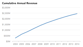
It is possible to use data visualization in a way that only tells a portion of what is really occurring. A prime example is when using data to create a cumulative graph to show growth over time. For instance, a graph that is nothing more than a compilation of a company’s revenues over a period of years will not indicate whether the revenues are increasing or decreasing from one year to the next. Unless the audience takes the time to closely scrutinize the data, audience members may believe that the company’s revenues are increasing, when they may actually be in a steady freefall.


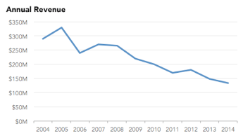
This example shows how misleading using a graph showing cumulative data can be. The cumulative graph on the left indicates the sum of the company’s revenues from 2004 to 2014, which makes it appear that the organization has experienced constant growth over a period of a decade. But when you consider that a company’s cumulative revenues can do nothing but increase — assuming it stays in business and generates any sales at all — this graph really provides little in the way of meaningful information.
The graph on the right depicts the actual amount of revenue generated each year, instead of on a cumulative basis. It illustrates that the revenues have been in gradual decline over the past several years, a more truthful and precise measurement of the company’s recent and long-term performance.
4. Deviating From Standard Practices
There are certain standard practices that apply to using mapping for data visualization. Deviating from these practices can render the chart or graph virtually meaningless. For example, the typical pie chart includes segments or “slices” of data with assigned values that should add up to 100 percent.
During the 2012 GOP presidential primaries, however, the Fox News Chicago affiliate displayed a pie chart where the values of the segments regarding the voters’ preferences of the three main Republican candidates totaled well over 100 percent (poll respondents were permitted to make multiple choices). When displayed as a pie chart, viewers were led to believe that each candidate had garnered about one-third of voter support, when this was actually not the case at all.
5. Improper Scaling Methods
One issue with displaying images on a bar chart or graph is that the dimensions of the images may be scaled in a disproportionate manner, which can be misleading to the viewer. If one image is meant to represent a value that is twice that of another image, but the image itself is actually four times larger, it fails to give the viewer a true indication of the actual relationship between the two. Thus, the viewer may interpret the data as if that one company is generating four times the sales, profits or market penetration than the other, when the actual value is only two times as much.

How to Create Effective, Accurate Data Visualizations
From an ethics and accuracy standpoint, most businesses wish to avoid misleading with their data, whether intentionally or unintentionally. Displaying a map, chart or graph containing information that deceives a customer is a sure way to lose business and give your company a less-than-favorable reputation throughout your industry. Just as important, relying on skewed data will likely lead you to make poor decisions that negatively impact your company’s performance — not to mention your bottom line.
Tips to help you use data visualization in an accurate and ethical manner include:
- Simplicity: Most mapping software contains a wide range of features, some of which you may not actually need. A good approach, however, is to determine what you actually wish to achieve through data visualization and limit your selection to the features that will help you reach your objectives. In many cases, a simple bar chart or line graph can serve your purpose, and you will avoid adding layers of complexity that could lead to the misrepresentation of data.
- Think of Your Users’ Needs: It is likely that several individuals in your organization will want to use data visualization for presentations, decision-making, competitor analyses and more. Use your mapping software to create a dashboard that makes it easy to drill down to the specific information that all users may need. This will make your mapping software package much more user-friendly so anyone can create effective, accurate, task-specific data visualizations.
- Create Accurate Comparisons: The best data visualization techniques add context that makes it easy for the user to make accurate comparisons. A bar graph that compares sales revenue growth from one quarter to the next or a pie chart that illustrates the amount of market share held by you and your competitors provides a clear understanding of where you are and where you have been, which can prove invaluable in helping you determine where you’re going.
How to Avoid Being Deceived by Maps
If you are a regular consumer of data visualization, it is important to take a proactive approach when reviewing maps, charts and graphs that have been prepared by others. Closely scrutinize the actual data, instead of only the visual component of the display. If the information doesn’t make sense, ask the presenter for clarification or ask a colleague for their interpretation. In other words, don’t believe everything you see!
Learn more about the true benefits of using accurate data visualization for your business functions today! Have a question for MapBusinessOnline? Don’t hesitate and contact us today!


