Improving Business Communications With Dynamic Data Visualization
Business communication is of primary importance to commercial entities across the financial sector. From online retailers to utility services, there's an ongoing quest to improve the methods for gaining leads and closing sales. Thanks to new innovations, communications can now be streamlined across all departments of a given company. Spurring these advances is a concept known as dynamic data visualization, which is one of the key elements of business mapping software.
What Is Dynamic Data Visualization?
On a monthly basis, customers receive statements from banks and credit card companies that contain visualization tools such as pie charts and graphs. The purpose of these tools is to help customers understand their own spending trends, and this in turn allows customers to budget accordingly. However, several steps can be taken to enhance data visualization in ways that cover more than just trending information. When graphs and charts contain interactive options, more in–depth details and cross–referenced information, data visualization becomes dynamic.
How to Use Dynamic Data Visualization
Visualization tools have long been used to provide customers with a clearer understanding of information contained in the fine print. Likewise, one of the key traits of effective business communication is the powerful use of imagery. After all, an image can speak a thousand words, whereas most customers are less enthused to actually read a thousand words, or even a mere hundred if it consists of dry financial information. Thankfully, images can be rendered far more effectively when companies learn how to use dynamic data visualization, which basically breaks down to the following three categories:
Interactivity
With a customer statement, the facts of a given customer's transactions with a business are essentially etched in stone. When a statement is enhanced with interactive, online features and made accessible on a secure, encrypted, password–protected server, the customer now has a dynamic range of options. Through online visualization prompts, a customer can monitor charts on a day–by–day or week–by–week basis and filter information to suit their needs. Other types of information that a user can access through online filters include the following:
- Transaction data: If a customer needs information on a particular transaction, the info can be accessed by clicking the link of said transaction, which can usually be searched by time and date of occurrence.
- Spending totals: If a customer is trying to tabulate how much was spent on dining out versus eating in during a two or four–week period, the info can be culled by narrowing down spending records to the timeframe in question.
In addition to making it easier to track finances, interactive visualization makes it easier to gain answers to long–confusing mysteries regarding charges or bank statements. If a customer prefers charts over graphs or vice versa, visualizations can be set according to preference.
Extensive Databases
There are some cases in which a customer needs access to more than just the prior 12 months worth of transaction records. With an extended database, transactional archives going back since the start of an account can be provided in year–by–year document files. This can come in very useful if a customer is subject to an audit by the IRS. An extensive database can also come in handy for account holders who simply wish to reevaluate spending trends over the preceding five or ten years.
Multiple Content Sources
Not all account holders place their eggs in one basket. Many customers would like the option to view all accounts or systems in one place for cross–referencing purposes. With multiple–source options, customers can analyze info in any given number of ways, including the following:
- Compare different areas of spending: If a customer needs to compare his annual basic living expenses to the amount he's spent during twice–yearly trips overseas, he could access one account through another and view the data side by side.
- Contrast charges and returns: Alternately, an account holder could contrast the amount of credit debt she's amassed over the last four quarters with her income tax returns.
With multiple–source options, a customer can access all types of data in one place for easy problem solving. The combination of interactive features, extensive databases and multiple sources provides customers with a dynamic set of tools for an overall more satisfying experience.
The Benefits of Data Visualization
With graphs, charts and other graphic formats, data visualization presents info in a manner that is more readily assimilated by the average consumer. The easy readability of such graphics presents a sharp contrast to the confusion and boredom that's often associated with imageless rows of dry text. Regardless of whether it appears on a spreadsheet, computer screen or plain white piece of paper, textual data typically comes across as cluttered, unfocused and difficult to follow or understand. Communicating complex business data becomes much simpler when it is dynamically visualized.
Heightened Brand Exposure
A press release that incorporates well-designed data visuals is likely to stand out from the piles of material that journalists and PR execs are swamped with on a daily basis. This is very beneficial when distributing a press release, because the visuals increase the likelihood of it getting chosen over the PR materials of competing entities.
Stronger Impressions on Consumers
Visualization graphics help audiences gain a quick understanding of the crucial math involved in a given set of data. Providing that the visuals are laid out clearly, a consumer could gain insights that would otherwise be missed, and in turn use that information to make more informed decisions going forward. The emphasis here is on "well–designed" and "clearly laid out," because images that lack those qualities could have the reverse effect and end up confusing, misleading or even alienating viewers.
In short, a visual needs to have three key qualities in order to succeed with viewers:
- Eye–catching design: Whether it's a chart, graph or something else, the image must stand out on a page or Windows browser with its uniqueness.
- Informative contents: Regardless of how succinctly the info is conveyed, it must provide viewers with useful, digestible info.
- Factual accuracy: The information must be truthful and not cherry–picked or speculative.
At the same time, the image doesn't need to be especially fancy to convey its intended purpose. Often times, the simplest designs are most successful at putting the message across to viewers. A design could be memorable for its creativity, but fail to provide the necessary information and thus lack the "data" in data visualization.
Benefits of Business Mapping Software
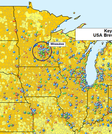
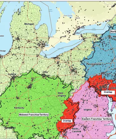
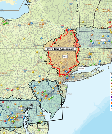
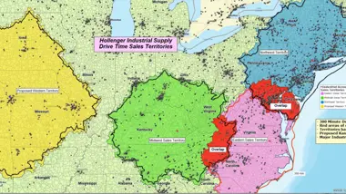
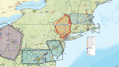
Throughout the financial sector, one of today's most dynamic forms of data visualization is business mapping, in which figures and stats are color–coded by area. With business mapping software, work teams and colleagues can edit and update categorical overlays of select maps as leads mount, sales increase and figures are calculated throughout a given day. Whether an update is made collectively or individually, mapping is a powerful tool for keeping work teams synchronized in regards to advances and gains, as well as losses and oversights.
MapBusinessOnline offers the most complete set of mapping software tools on the market today. The software can be used to streamline how businesses teams communicate at all levels of operation, from marketing and logistics to sales and management.
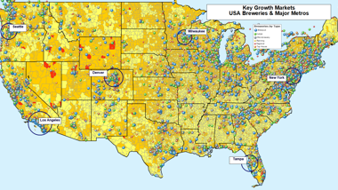
Marketing: Business mapping software is used by marketing teams to analyze markets by region, state, country and ZIP code, variables of which can be used to gain the following:
- Market info: Based on how a select area is color coded, marketers can tell whether sales are up, down, steady or stagnate in said market.
- Market stats: With different overlays, the same exact territories can be color–coded by different sets of variables, such as population density or household–income averages.
- Marketing insights: Once the overlays are compared and contrasted, a marketing team can then determine the reasons why sales might be strong or weak in a given market.
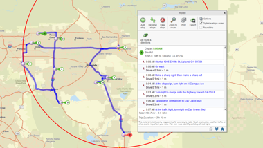
Logistics: In business mapping, up-to-date base map data is used to optimize routes to each destination. As a result, companies are able to ship faster for less, while maximizing clock hours and garnering loyalty.
- Faster deliveries: Products get delivered with far greater speed to each destination along delivery routes.
- Reduced shipping costs: With optimized routing, companies save money on shipping products and delivering services because fuel consumption and vehicle–maintenance needs are significantly reduced.
- Improved efficiency: Companies also save time with shortened routes, freeing up more business hours that staff can then spend closing leads and generating sales.
- Customer loyalty: Faster deliveries equal increased customer satisfaction and loyalty, as well as positive brand recognition.
Sales: With business mapping software, sales teams can plan more effectively while understanding exactly which areas are hot in terms of leads, contacts, sales and repeat customers.
- Success tracking: Areas in which sales are hot could be color–coded red, while less plentiful areas could be color–coded blue.
- Improved strategies: On an overlaying map, demographic factors could be analyzed on an area–by–area basis, and that info could be used to determine subsequent sales strategy. Could sales in a poor–performing area be improved through refocused efforts? Or do external factors — ill–suited demographics, low population counts — render such efforts a waste of time and resources.
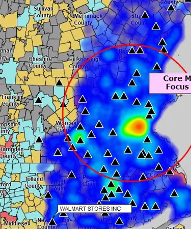
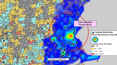
- Corrected oversights: At zoomed in levels, a heat map can show whether sales in one ZIP code contrast with a neighboring, similarly affluent district. Sales teams can then determine whether the disparity is due to a lack of ground work, or whether key ZIP codes have been overlooked in the lead lists.
Management: Company higher–ups can apply business maps to make performance evaluations of sales teams and individual sales representatives. As such, management teams gain valuable insights into the nature of things on the ground floor.
- Team analysis: If one team is outperforming the others, overlays can be used to determine if this is due to said team being assigned the most lucrative areas, or whether there's a strategy at play that other teams could emulate.
- Efficiency grading: Likewise, if one team is lagging behind the others, an analysis of maps could help determine whether it's because of negligence from the team leader, inaction on the part of salespeople or simply down to a poor coverage area.
- Performance evaluation: The performance of teams can also be evaluated to see who's thriving and who's lagging in terms of closed sales. Decisions can then be made if a given salesperson is due for a promotion, demotion or termination.
Team Editing: Collaborative team editing of business maps leverages cross department resources with a map focus on shared problems. Enterprise managers are able to leverage the best minds in receivables, accounting, shipping and sales toward resolving customer issues.
- Team map editing engages the best minds of your company and forces them on your biggest challenges.
- Collaborative map editing controls who can create and edit business maps and who can view or derive data from those shared maps.
- Team maps communicate business realities and results quickly and efficiently.
As one of the best business communication tools currently in use, mapping helps businesses seize markets, cut losses, speed up deliveries, boost sales and maximize operations with far greater efficiency and accuracy than would ever be possible with simpler evaluation tools like plain charts and graphs.
Features of MapBusinessOnline's Mapping Software
With its multitude of features, MapBusinessOnline offers the best business communication software for operations of every size across the retail, financial and utility sectors. As today's leading form of dynamic data visualization, the software is designed to make communicating with business maps as easy as one two three. Optimized and updated quarterly for web browser access from Windows and Mac OS, the software allows users to format mapping overlays in a variety of styles. The following features are currently among the most popular with users.
- Collaborative editing: Interactive web maps can be shared amongst all company personnel or restricted by management to select teams or individuals. Updates can be made in–house from a PC or in the sales field via laptop. With password–protected access, collaborative efforts can be coordinated locally by smaller operations or cross–country by larger enterprises.
- Customizable graphics: On any given map, areas can be grouped and categorized with fill colors. Map objects can be added as necessary - circles, rectangles, drawn lines and text boxes.
- Multiple sourcing: Maps can cull details from a variety of sources for pinpoint accuracy along streets and within city boundaries and zip codes. With a data–inputted spreadsheet, 250,000 locations can be plotted per map.
- Searchable data: Search location data on a map to determine the best shipping points in ustomer–dense areas. This can be used to optimize routes and calculate shipping related expenses.
- Heat mapping: Customer densities can be displayed by intensity as one color blends into another on heat maps. Which areas are red or orange, yellow or green, turquoise or blue? Heat maps reveal all where the action is – or isn’t.
- Poster prints: Maps can be exported to PDF format and printed out as large as 60" x 60" for office wall display and presentational purposes.
- Data visualization: Business mapping can be embellished with other forms of dynamic data visualization, such as bar and pie charts, which could be used to show sales figures, shipment rates, payments due and various other stats.
With these features and many more, communicating with business process mapping is easier than ever before.
Sign Up for a 1-month Free Trial With MapBusinessOnline
MapBusinessOnline offers one of today's most powerful visual strategies for effective business communication. To experience the unique, effective, easy–to–use features of MapBusinessOnline, sign up today for a 1-month free trial.