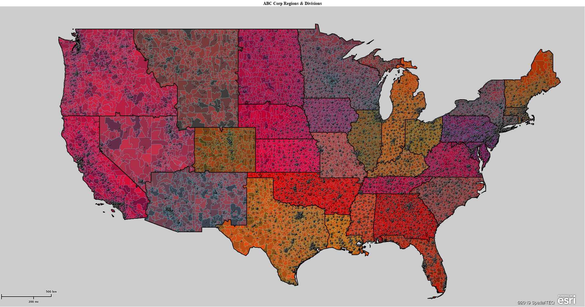
How could this sales territory map be improved? At first glance, many might think this is a great map. They might even wish they could develop a business map that looked like this map. But does this map serve its purpose, a territory map, in the best possible way? How could we improve its look?
The first thing I think of when I look at this map is – the map is too red. Why is that? Well, as it turns out the ZIP code layer is color-coded by Census population data, using a graduated red color scheme. I could tell that this was the case by retrieving the Map Legend and turning on the ZIP code layer in that legend. Read more about map legends in Map Business Online.
Another way to check for color-code schemes is to click the Color-Code map button and see what data is selected and how it has been shaded.
An additional aspect I don’t like about the map is the “Prospect” point layer color choice – black. Against the dark red ZIP code map layer is too dark for the map viewer to distinguish the black points against the map. Dark points against a dark map get lost, in the sauce. “Make it stop!” For now, I just turned it off. But you could make the point layer color a lighter Blue or Yellow.
As we use Map Business Online to create business maps, our stored map library gets more and more populated. We might create a map on the fly for general business purposes and as that maps get used for this application and that application, its applicability could deteriorate to the point where your attention may be required. You need to re-edit that map.
A Cleaner Business Map
Back to my map issues. I can do a few things right away to get my map back to where I want it to be.
- Using Map and Data I can uncheck the ZIP code layer and the Region layer, re-exposing my territories, as originally intended.
- I can also uncheck the Prospect point layer using Map and Data.
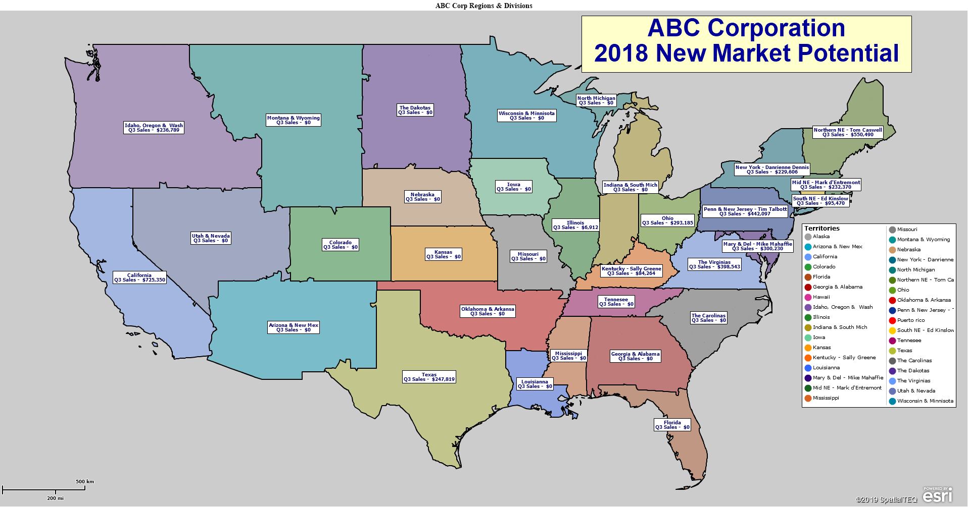
When I uncheck these layers and just view my territory layer, the map becomes much more effective as a communicating visualization. It clearly defines a group of sales territories. The labels are off, and the black Prospect points are gone. Personally, I like this map view.
It’s clean:
- The territory boundaries are clearly defined.
- The fill colors of the territories are not overstated, and the colors used are fairly balanced – not too many overlapping shades. That is a thing.
- There is no background map applied in this case. Sometimes that’s a relief on the eyes. Sometimes the viewer needs the background map for spatial reference.
A Map Business Online user can control the map legend placement from within Map and Data by clicking the Map and Data Edit Gear and choosing to Edit Map Legend. You can see how selecting the territory layer in legend control adds value. It clarifies what this map is all about. You could add more layer definitions to the legend but do so only if it’s necessary for communicating map meaning. Map legends quickly get crowded and lose value.
Rethink Your Labels
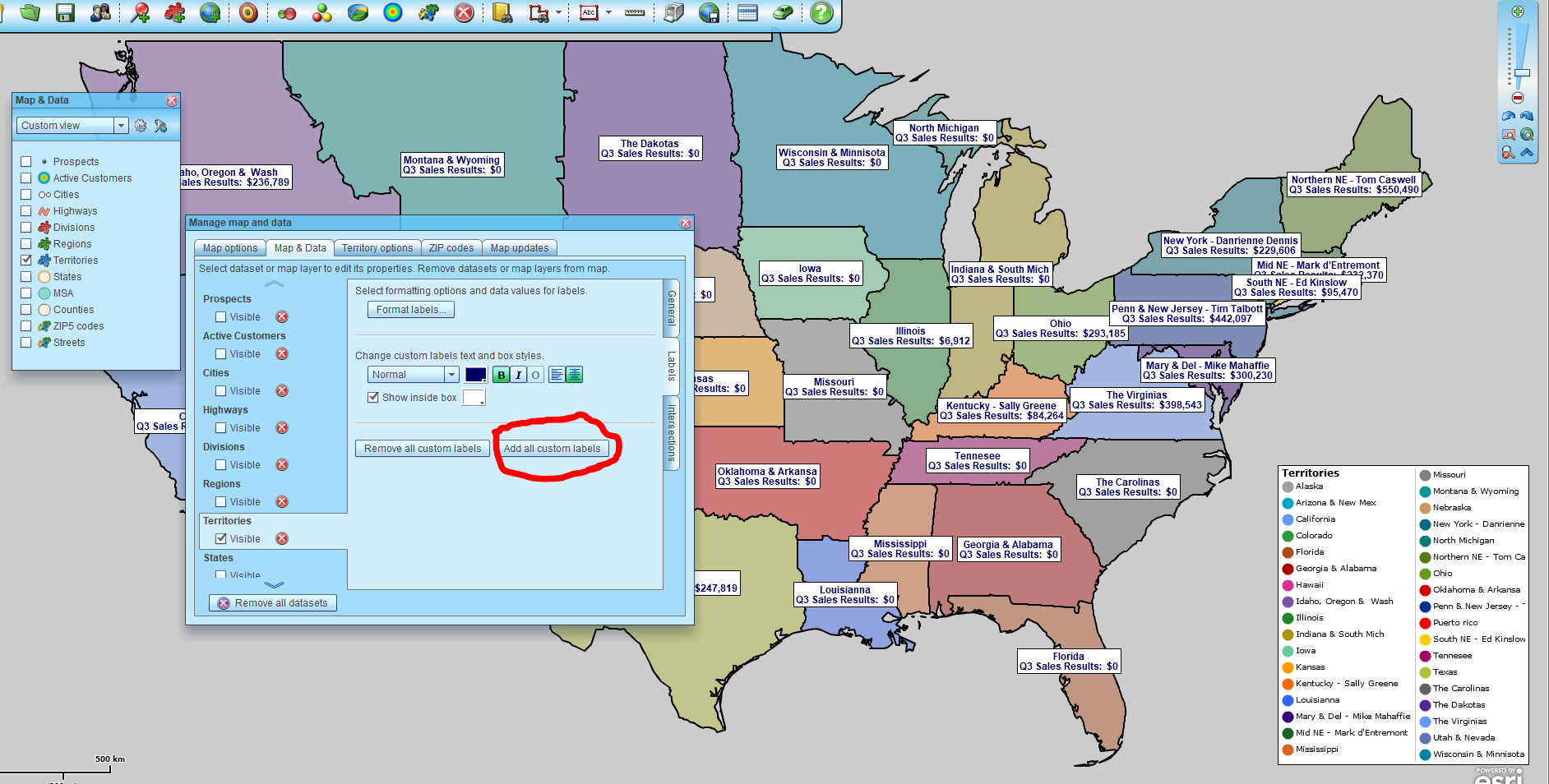
But we should probably address labeling. Because a territory map usually requires labels to help the map viewer understand what they are looking at. And, in Map Business Online, it’s easy to aggregate numeric values from imported data, like sales figures, into the label. So, here’s the same map with labels turned on. I left the Map and Data label dialogue in the picture view so you could see the Show Label button – “Add All Custom Labels.”
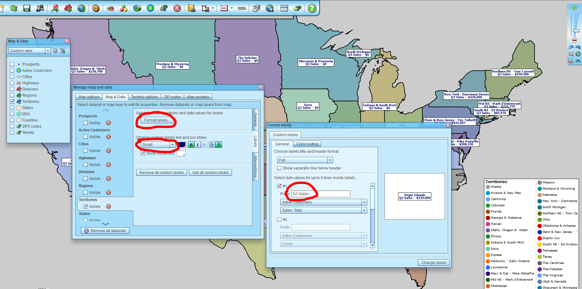
Now as I look at those labels, I think their clarity could be improved. So, while still in Map and Data, I’ll choose Format Labels and where I’ve already selected the labeling scheme and I will adjust the label text to remove the word ‘results’. I also changed the font size of the label to small. Now the map appears more concise and less cluttered. A final label tweak – I manually moved the overlapping labels apart with my cursor.
The last move I’m going to make on this map is to turn the Map Title back on. That’s also located in Map and Data, under edit map properties. The map title can add that obvious statement explaining what the heck this map is.
I write all of this to give the Map Business Online user a sense of how to adjust some map controls to get back to a map that communicates effectively. And to show that even after you’ve created and settled on your map view, going back and viewing it later may expose some easy updates that will make your map sing once again, or for the first time.
Are you using the Map Business Online Desktop App for MAC or PC? It’s hipper than Instagram and it comes with your subscription. Escape Web-Browser Tyranny!
Value-Added Resellers – Offer the tool to your customers as a reseller. Make money on training and consulting. Contact us with further interest in reselling Map Business Online.
Win a $20 Gift Card! Refer a business associate to Map Business Online in exchange for a $20 Amazon Gift Card!
America’s best geo mapping software.
Find out why over 25,000 business users log into www.MapBusinessOnline.com for their business mapping software and advanced sales territory mapping solution. The best replacement for Microsoft MapPoint happens to be the most affordable.
Discover Map Business Online – tools for making maps for business


