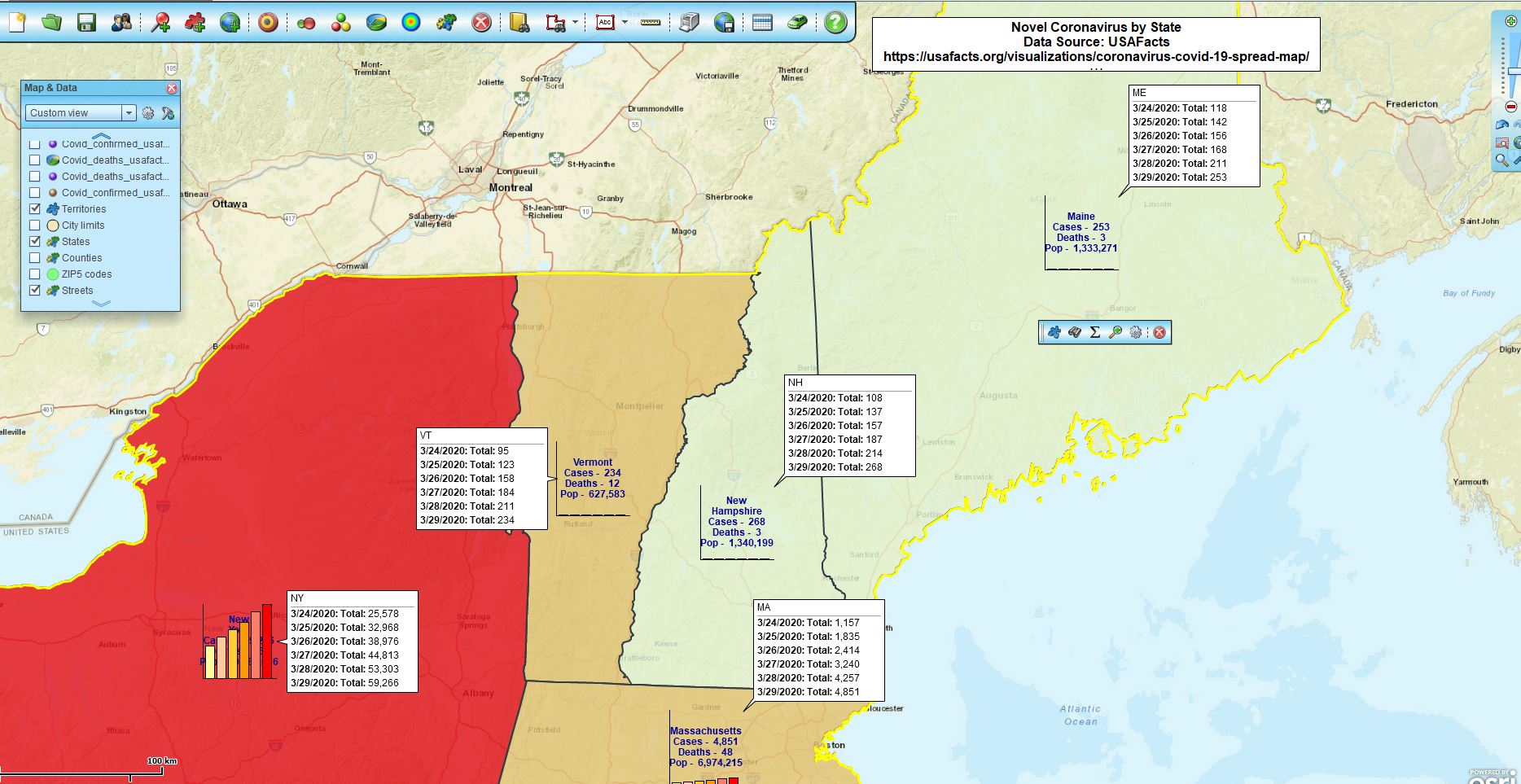
For the second week in a row, I’ve interrupted the usual blog schedule to talk about mapping the Novel Coronavirus.
Tracking the spread of a virus is certainly an interesting use of business mapping software. It can also be quite overwhelming when you are paying attention to the numbers day-to-day and they are increasing at an exponential rate. Further, as many of us are finding now, people we know are getting impacted by the disease. It’s personal.
In the included map image below, I’ve used the Chart symbolization options from MapBusinessOnline to compare six days of COVID-Case status. Notice that the spread is rather uniform when compared state-to-state. By that I mean the rate of the spread is similar from state-to-state, while the overall numbers are larger where there are more people.
This tells as much about the nature of the United States as it does about our overall response efforts or the contagion’s aggressive spread. We are truly living in a global community. So many hotbeds of COVID-19 are the result of traveler carry. From a city in China to a world shut-down in three months. It’s impressive.
The map tells a story about testing too. I believe one important factor in accounting for the rapid rise of confirmed cases is the availability and application of more tests. We found out this week on national news of a company located right here in Maine, Abbott Labs, that has developed and received FDA approval for a testing kit that will provide COVID-19 case confirmations in 15-minutes. The company hopes to manufacture up to 5 million test kits a month. Yikes! Rock on Abbott Labs.
Time-lapse Maps Using MapBusinessOnline
Another approach we came up with is a time-lapse map. A time-lapse map records one map view with data changes over time. We’ve tried several approaches to this concept. As in all business maps, considering your map audience is important. Try to consider what your map viewers might be looking for.
In this case, there were several critical factors to include in the time lapse map:
- Contagion data – reflect the case count by day or by week
- Post the date of the data
- Include a legend describing the color-code scheme by county
- Provide the right map background to keep the focus on the spread over time
The process is relatively easy, but the time-lapse map creator needs to pay attention. In addition to MapBusinessOnline, you will require a recording software. I used SnagIt from TechSmith. SnagIt is a great, low-cost screen recording tool.
Once you have a recording complete you’ll need to share the map somehow. Www.YouTube.com is a great presentation option.
Once the MapBusinessOnline map is solid, with all the parameters required, get ready to record.
Test the Recording Process First
Because I was recording a color-coded county layer map, I did a couple of trial slides changing the data column from day-to-day. The USAFacts data includes every day of the contagion by column. Therefore, I set up my Color-Code Map button with the first date, made sure the date was referenced in both the Map Title and the Legend and applied the color-code scheme across the range of confirmed case values.
One way to control the data ranges is to set up a broad numeric range that covers the contagion for the entire period and leave it that way for all slides. This presents a more striking visual contagion growth pattern. Another way to view the ranges is to adjust the ranges as the contagion grows – every five days seemed to warrant a larger range spread. On March 1 there were only 1 to 10 confirmed COVID cases, but by March 29 the total caseload had risen to about 13,000 cases across the USA. The latter method offers a little more value detail as the contagion maps march through time.
Another thing to consider during your trial recording is the length of time for each map slide. I felt four seconds was a minimum time requirement for the viewer to absorb the map view. A map viewer can always pause the YouTube video.
Once you’ve decided on how you will or will not manipulate the range presentation, get ready to record. In your mind, or on paper have a process for each slide:
- Press record and count or watch the count for four seconds and stop
- Update the Color Code Map process with the next data or column of data
- Adjust the color-code ranges as required (or not)
- Adjust the map title and legend as required
- Rinse and repeat (Shampoo joke)
Record your first slide. Now keep going for the thirty days in the month, and don’t fall asleep.
That’s the process for creating a time-lapse map experience using MapBusinessOnline. It probably takes two to three hours from map creation start to recording finish. Once you’ve done it, it’s an easy way to show map changes over time.
Special thanks to Bill McNeil for the idea.
______________________________
Are you using the MapBusinessOnline Desktop App for MAC or PC? It’s hipper than Instagram and it comes with your subscription. Impeach Adobe Flash Player!
Value-Added Resellers – Offer the tool to your customers as a reseller. Make money on training and consulting. Contact us with further interest in reselling MapBusinessOnline.
Win a $20 Gift Card! Refer a business associate to MapBusinessOnline in exchange for a $20 Amazon Gift Card!

