What defines America? I think this is a question many of us have been asking ourselves over the last ten days. Who are the folks that make up our nation? It’s a wide range of groups. On a very basic level, a business map, with Census published demographic data can roughly describe the major segments of American society.
Demographic data for the USA is largely defined by the ten-year Census data collection. This once a decade process is happening now across the nation, as I write this blog. That decennial census will be updated and re-estimated every year until 2030 to keep up with increases or declines in populations by area around the nation.
MapBusinessOnline provides access to that Census Bureau demographic data layers and provides a set of tools for you to review that data from a variety of perspectives. When carefully crafted a demographic map can be relevant to political, social, or business conversations or analysis. But one must present your political map in as unbiased a way as possible or your map will lose credibility.
Demographic Data in Political Maps
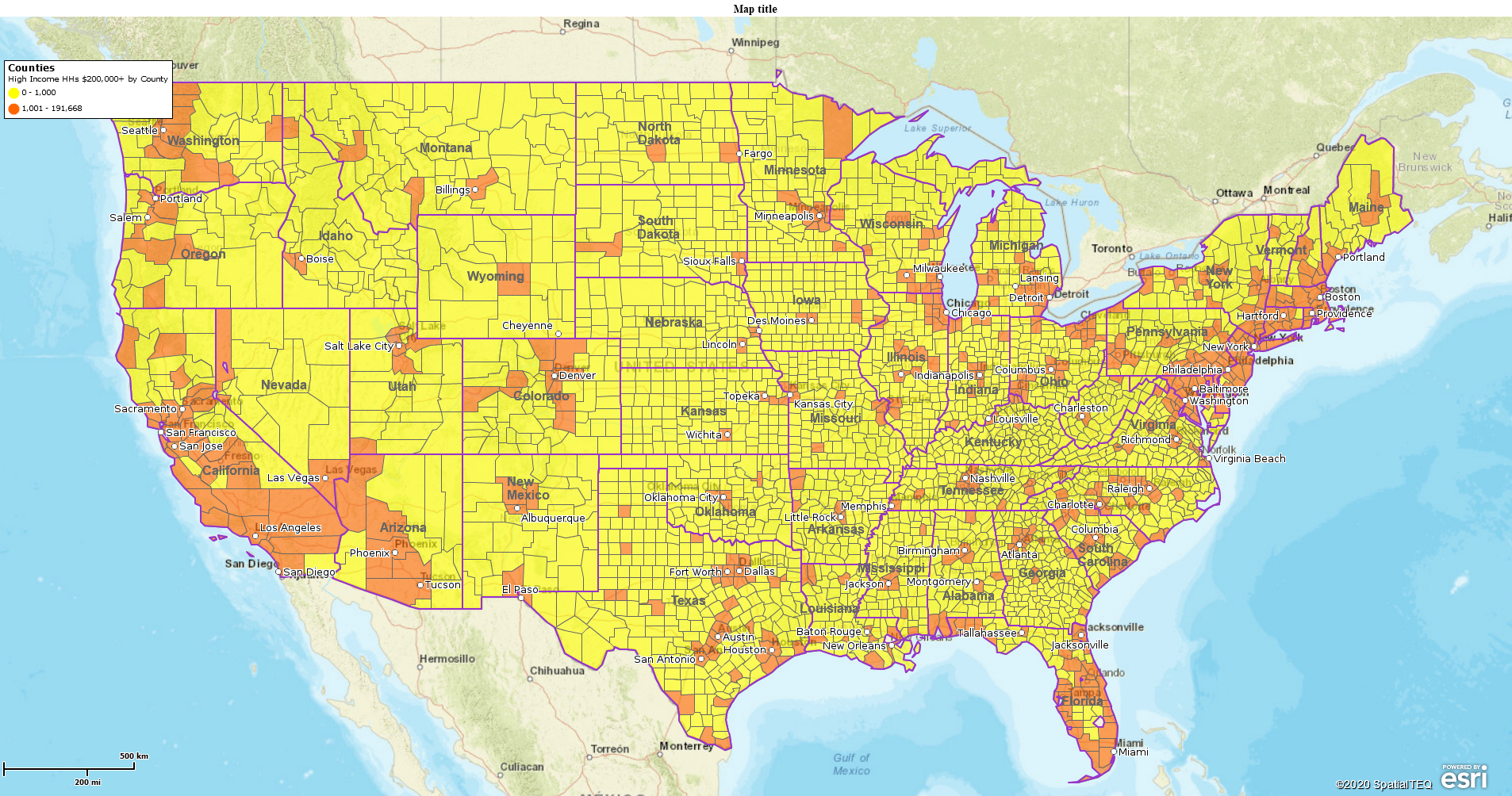
My first map, above, shows where the highest-income households are located. I selected the Demographics Layer for Households with incomes of more than $200,000 per household per year. Using the Color Code Map Button, I color shaded the county layer to show counties with 0-1,000 high-income households, and the counties where at least 1,001 or more of those high-income household earners reside.
One could argue there are better ways to segment the household allocations in this map view. MapBusinessOnline lets you control those allocations or ranges. You could add a few more ranges or segment the household quantities at different range points. My only recommendation is to keep it simple and be able to explain why you chose the ranges displayed on your map. MapBusinessOnline does offer a range suggestion which is an algorithmic application that weights the range scheme. I usually prefer a simple numeric range – 100, 250, 500, 1000. That sort of thing.
Please note, on this map, I turned on the State Layer for reference, changed the border to a thin purple color for easy-on-the-eyes definition, and I added a City point layer, also for reference. Keep that demographic or political map simple to view. Use colors that are pleasant to look at. Don’t complicate a map that’s bound to generate questions based on the subject matter.
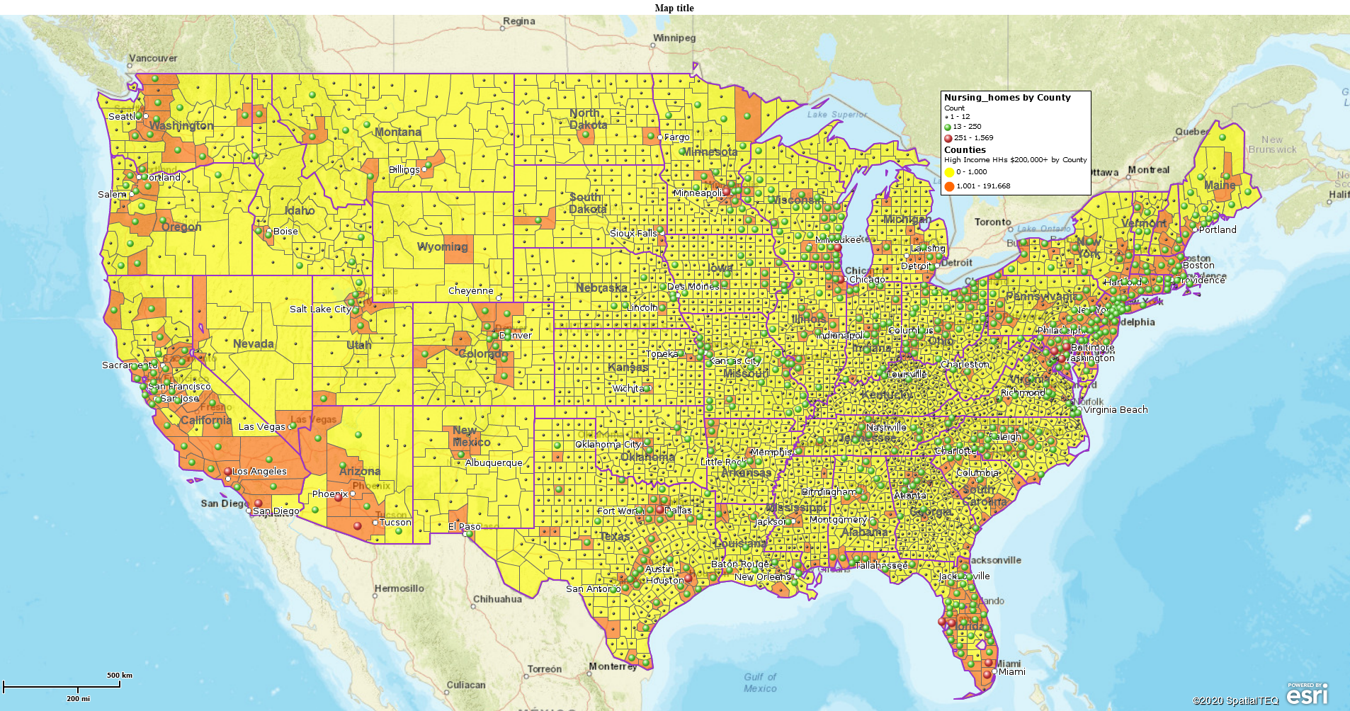
I’ve added one more layer to this map – a point layer of nursing homes. I color-coded the point layer by county and set up a range to focus on where most of the nursing homes are located. No need for comment. Adding a relevant data layer changes the meaning of the map. The Pandemic, in my humble opinion, has shifted how we view the placement of our elderly in nursing homes. It’s relevant to almost any political map right now.
It’s difficult to say how the various divided political factions might view the above map. A Black Lives Matter group might refer to it as the White Privilege map. While Mitch McConnell might refer to it as his Most Lucrative Political Donor map. It certainly would appear, based on national news, that the political and financial implications of this map show a minority of households controlling a majority of wealth. This is a demographic fact based on location-based demographic data, not on opinion. The map simply answers the question, where does most of the money live?
Further, the map displays how, while our political and economic realities may divide us, we all live in the same general regions. Most of the recent protest cities are the very same cities where the wealthiest American households reside. At least, location-wise, we truly are all in this together.
Apply Calculated Data Columns
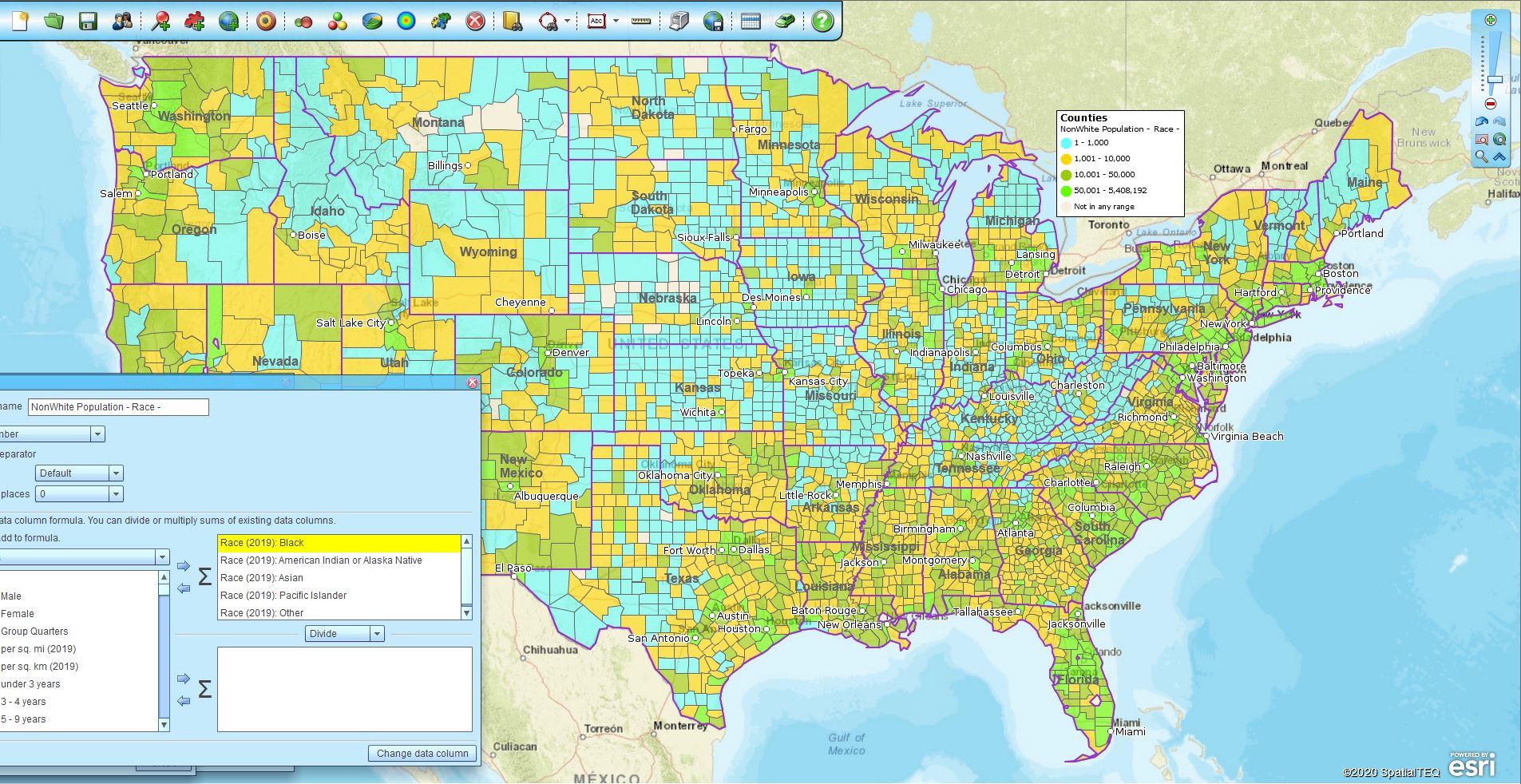
Another way to use MapBusinessOnline is to combine or sum demographic data layers using the Calculate Data Columns functionality. MapBusinessOnline Calculated Data Columns easily combine demographic data layers into new and relevant map views. Read about how to use Calculated Data Columns.
This racial demographic map uses Calculated Data Columns to total up all the non-white race layers into one NonWhite layer. I left the Calculated Data Column dialogue open to show where the numbers are derived from. If we zoom-in to a county view we can describe the break down in population between whites and other segments. Now we must understand a little bit more about how the Census Bureau breaks down their categories:
"The race and Hispanic origin categories used by the Census Bureau are mandated

by Office of Management and Budget Directive No. 15, which requires all

federal record-keeping and data presentation to use four race categories

(White, Black, American Indian and Alaska Native, Asian and Pacific Islander)

and two ethnicity categories (Hispanic, non-Hispanic). These classifications

are not intended to be scientific in nature, but are designed to promote

consistency in federal record-keeping and data presentation."
It is important to recognize that the Census classification system treats race and ethnicity as separate and independent categories. This means that within the federal system everyone is classified as both a member of one of the four-race groups and also as either Hispanic or non-Hispanic.”
Source: https://www.census.gov/population/estimates/rho.txt
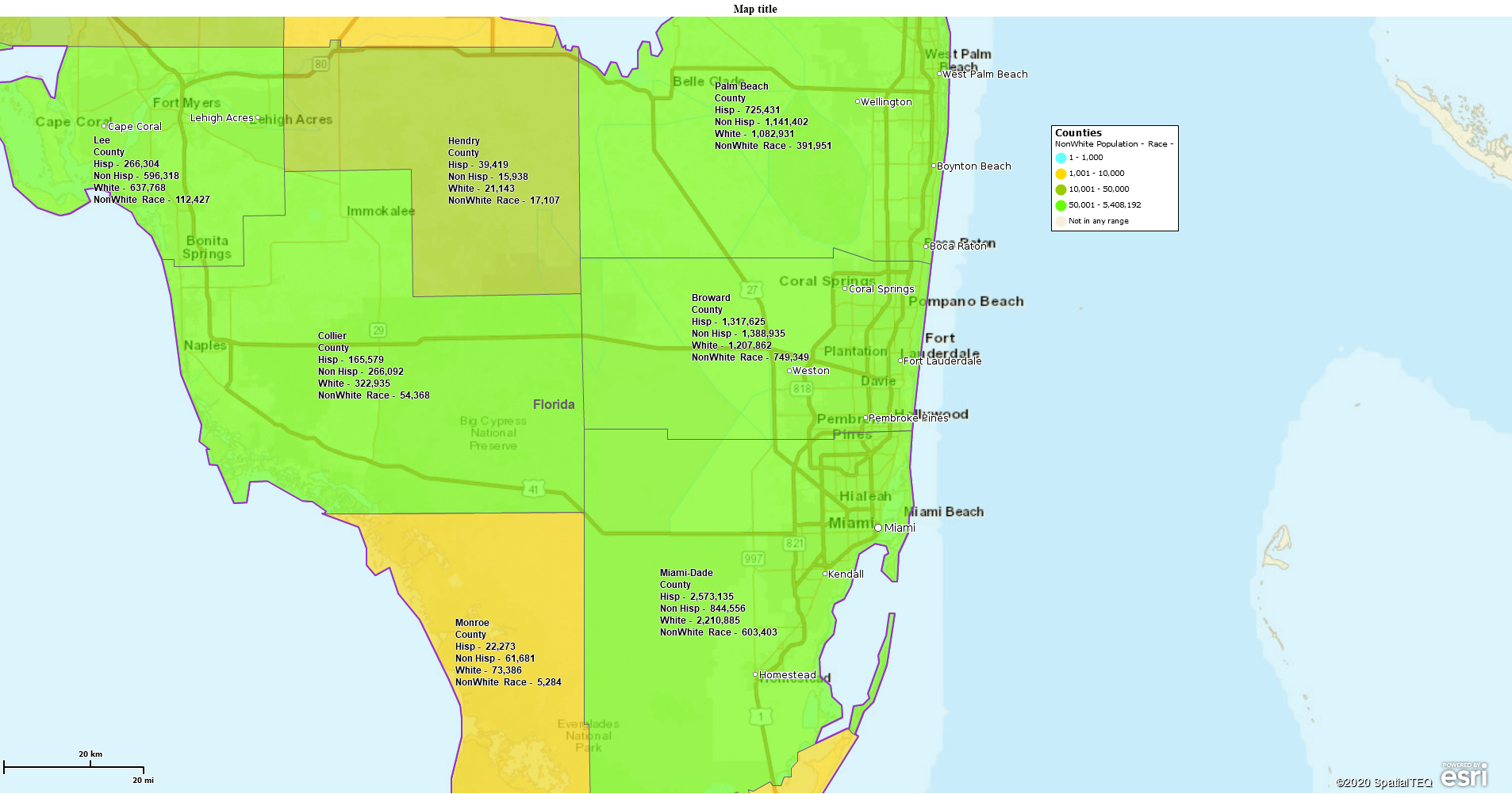
Using a combination of Calculated layers and as published Census layers, I have tried to show a comparison of the White population to Hispanic and NonWhite populations. If you were trying to show voter-power of any segment, it would be a difficult case to make with these totals. There’s a fair amount of overlap, in my view. But one could make the point that the white majority is under pressure. Especially if you zoom the map into everyone’s favorite electoral impact counties: Broward, Miami, and Dade counties on Florida.
Here you can see that no matter how you slice it, white America is becoming a minority. And it explains some of the political maneuverings from both political parties for Florida. A divisive issue like gun control inserted into an election between a white and a minority candidate can peel off voters from one side to the other.
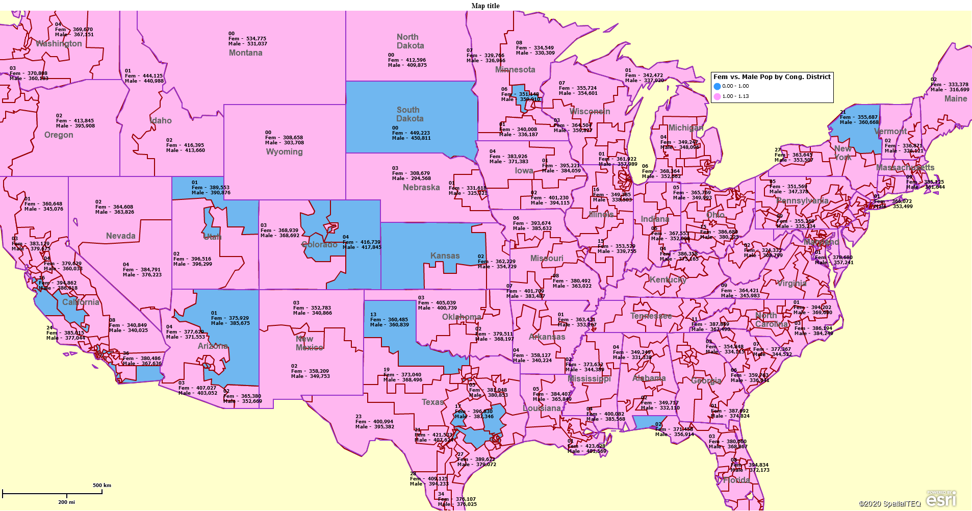
Finally, I’ll leave you with one more political map that may be of interest to Presidential Election Campaigns for the year 2020. I used Calculated Data Columns to run a formula:
Female Population/Male Population.
While Census population data does not reflect party affiliation or voter registration the map is telling. I used that ratio result to color code Congressional Districts, a map layer in MapBusinessOnline, pink for majority female and blue for majority male. One might think catering to the female vote would be wise for a political candidate in these pink districts.
I showed this map to my wife. After expressing her opinion, she drove me to the emergency room. I’m fine.
When building a political map, especially within a polarized political climate, make sure you understand your data and build your map carefully.
______________________________
Are you using the MapBusinessOnline Desktop App for MAC or PC? It’s hipper than Instagram and it comes with your subscription. Dump Adobe Flash Player!
Value-Added Resellers – Offer the tool to your customers as a reseller. Make money on training and consulting. Contact us with further interest in reselling MapBusinessOnline.
Win a $20 Gift Card! Refer a business associate to MapBusinessOnline in exchange for a $20 Amazon Gift Card!
v

