Let’s build a business map from scratch, using MapBusinessOnline.
It would be a good idea for you, the potential business map creator, to have at the ready a location dataset(s) of any relevant business operations you’d like plotted on your map.
For my map example, I’m creating a business map that shows beer breweries across New England. I sourced my data from the POI Factory, a cool little website with downloadable location data. You’re welcome.
Most map creators will begin with a specific business purpose in mind. They intend is that their business map visualization will suggest solutions to problems or suggest answers to questions that have been unanswerable through other business processes. Geographic views provide new perspectives that expose trends and offer new areas for business activities.
Select a Background Map
Once you’ve opened MapBusinessOnline, with the initial map view on your screen, consider the background map you’d like to include with your map. Choose a map background layer in Map and Data – the grayish box of layers hovering over the map. If Map and Data is missing, you’ll see a gray ‘>‘ or arrow smack dab in the middle of the far-left panel of your map. Read more about Map and Data.
You can select a background map at any time, but I like to pick one in advance. A fresh background map helps the geographic juices start to flow. So wear a geo-bib.
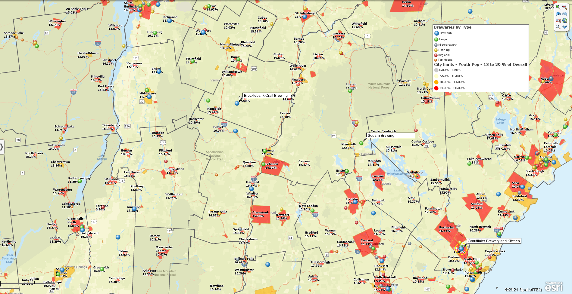
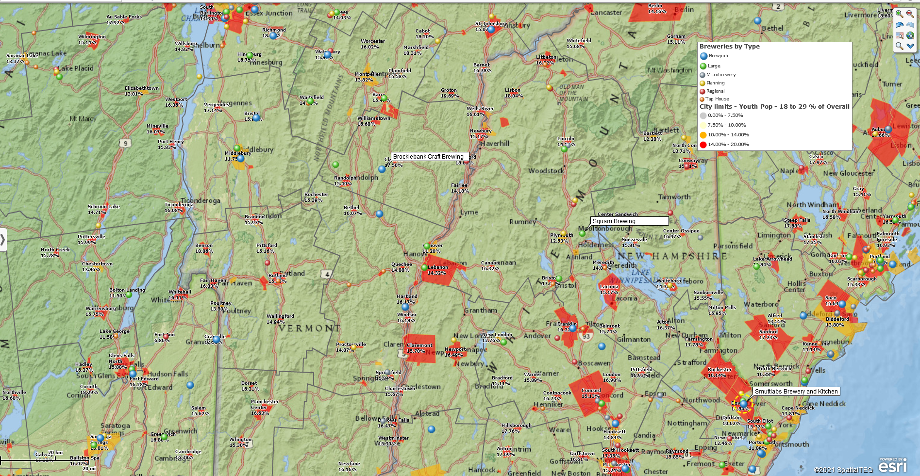
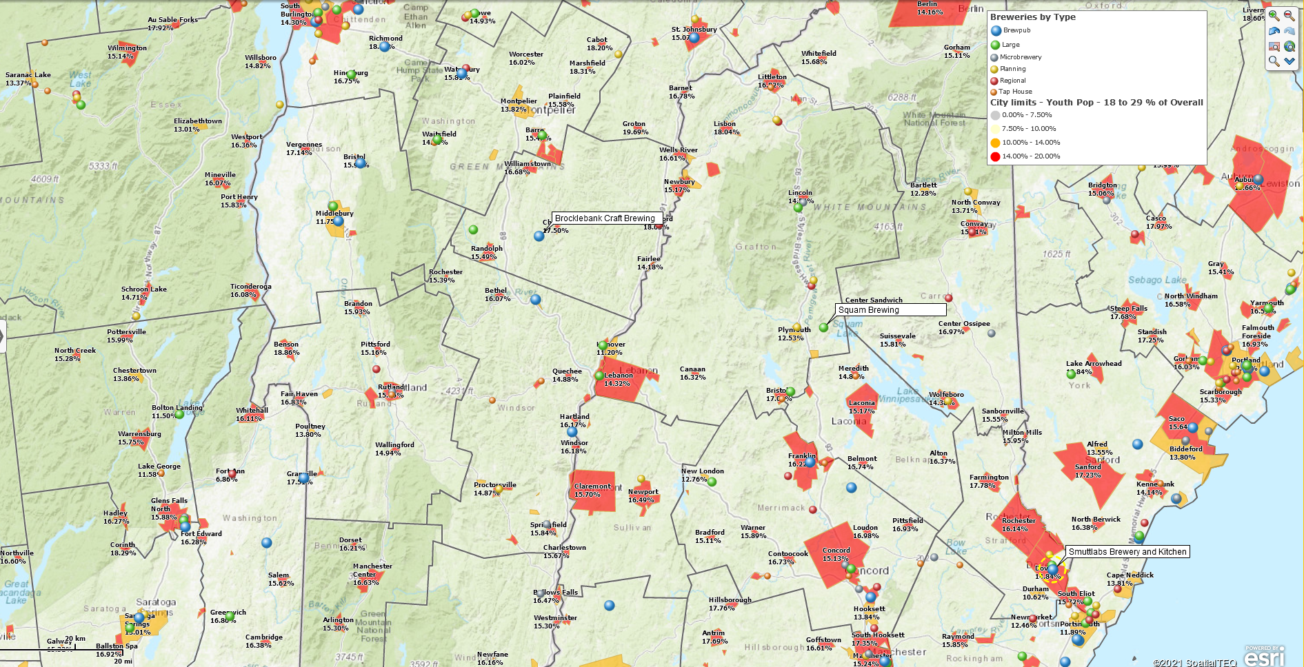
Streets is the default background map. I am partial to the National Geographic background map, which includes some interesting topography and is predominately green in color. The National Geographic background includes nicely defined state boundaries and names that do not conflict with the overall map purpose. Below are several background map examples:
You always have the option to select no background map at all. No background is a good option for demographic maps that do not require map orientation for the map viewer. For my map, a map of breweries, I thought topography might come in handy. Never mind why.
I settled on the MapBusinessOnline Topographic map background, another option in Map and Data:
And don’t get locked into one view or another. Every map creation is different. You can always tweak the various aspects of the map as your map nears completion.
Map Layer Selection
As a long-time business mapper, I generally have a pretty good idea of what map layers I will turn on for any business maps I create. You, as a new users of business mapping software, may want to give map layer selection some trial and error time.
Map layer control is in the Map and Data Box. It’s a checklist of map layers. You’ll see ZIP code, County, and State layers listed, as well as the background layer discussed above.
Additional map layers are available at the click of a mouse in the Layers button under the Add to Map section of the master toolbar. Add some map layers to the map view. Click them on and off. Get a feel for what works and what doesn’t work.
Import and Symbolize Your Location Data
MapBusinessOnline makes it as easy as possible to import location data. Still, importing data is a process:
- Click the Datasets Button
- Navigate to the data file location
- Select the data
- Process the import through the MapBusinessOnline import template
Follow the ‘bouncing ball’ and get your data placed on the map. Insiders call this process geo-coding. Read more about dataset imports.
Once your data is on the map, you can color-code and symbolize the map points based on columns included in the data. I looked for more detailed brewery data, but the data I found for free had limited business data. So, I added a fake Type column to the data and color-coded the imported breweries based on that column of data. I added classifications for the following types:
- Tap House
- Large
- Regional
- Brewpub
- Microbrewery
- Planning
In the biz, that’s what call classifying the data. There are lots of ways to classify data. You could classify businesses by sales values, or the number of employees. You could color-code your data based on a count per county or ZIP code. Read more about counts in MapBusinessOnline here. Decisions on color-coding imported data are based on how much value the process will add to your map. Please don’t do it for fancy colors, do it for improved map or business issue comprehension.
I wanted to visualize the data for the number of gallons of IPA sold, for example. That would have been a neat number to visualize, especially as a heat map. Unfortunately, the beer industry keeps those numbers close to the vest. Read more about Heat Maps here.
Adding Demographic Data
For my business map, I decided to add a demographic layer. I thought a city limits map layer color-coded by population might say something. It occurred that breweries placed in cities with a high percentage of 18- to 29-year-olds might do better. So, my map now reflects that demographic.
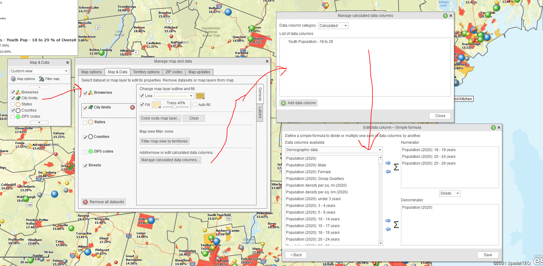
I constructed that layer using the Calculated Data Columns function in the City Limits map layer. Calculated Data Columns are available with every map layer through the Map and Data box. If you want to combine like data columns in a formula (sum, multiply, divide), you must set up Calculated Data Columns for the layer your targeting. Each map layer requires its only columns calculation.
In my case, I set up a new Calculation in the City Limits layer. I summed the three demographic age segments that comprise 18 to 29 year-olds in the numerator and divided them by the total population in the denominator. I then chose Percentage as the operation for display. You should also check your decimal point setting to keep things clean on the map view.
Next, I accessed the Calculated Data Column result from the Color-code by Boundary option under the Color Code Map section of the master toolbar. Just click the Boundary button and walk through the options. The Boundary button let me color-code the City Limits layer and describe the percentage of the population in the Map Legend. Read more about color-coding map layers here.
Read more about Calculated Data Columns here.
Wrap It Up
With my map completed, I review the result and tweak as necessary. Consider these critical business mapping concerns when completing and fine-tuning your map:
- Is the map’s purpose achieved?
- Is the map clear and concise to the map viewer?
- Are colors and symbols easy on the eyes and not overwhelming to view?
- Is the map background appropriate?
- Did you double-check spelling and grammar on any text presentation?
Keep your business map focused and uncluttered. These suggestions apply to all business mapping, from ZIP code maps to sales territory mapping. Make it easy on the eyes of your map audience and, you will be asked to build more maps. Hey, it beats ordering office supplies.
_______________________________________________
Find out why over 25,000 business users log into www.MapBusinessOnline.com for their business mapping software and advanced sales territory mapping solution. The best replacement for Microsoft MapPoint happens to be the most affordable.
To access MapBusinessOnline, please register and then download the Map App from the website – https://www.mapbusinessonline.com/App-Download.aspx.
After installing the Map App, the MapBusinessOnline launch button will be in the Windows’ Start Menu or Mac Application folder. Find the MapBusinessOnline folder in the Start Menu scrollbar. Click the folder’s dropdown arrow and choose the MapBusinessOnline option.
The Map App includes the Map Viewer app for free non-subscriber map sharing.
Please read customer reviews or review us at Capterra, or g2crowd
Contact: Geoffrey Ives geoffives@spatialteq.com or Jason Henderson jhenderson@spatialteq.com


